
Digipak one - MGMT: Oracular Spectacular.


This shows the front and back cover and the inside of the digipack.
The front cover image doesn’t extend across the panels as there are two different images for the front and back of the digipack. The image for the front of the digipack is a mid shot of both people that are in MGMT behind a beach backdrop. They are both wearing tribal clothing and hippyish clothing which suggests to the audience that the music would be indie/pop/electronic. The album is called Oracular Spectacular and the font of the text is sans serif and has a very unusual appearance to it. On the front cover there is a parental guidance icon on it. On the back cover it features track listings, bonus features, production details, barcode, date of production and websites that they can visit. They also feature the information and icon for the record label. On the inside of the digipack, there is an image which does stretch across all panels and it features production, recording and song writing details. Following this, there is also a part for their Thank you’s.
The background of this video at the beginning is directly linked with pictures from the digipack. This is good for advertising because of the direct link between the image and the video. This allows the audience to relate to the two together and if they didn’t know what the video was called and they saw the album cover, they would still be able to establish the link between the two. The genre is around the indie/electronica genres and we can tell this because of the way that they dress, the beach which is the background and the way everything just looks unusual and random with bright colours.
The genre for the artist is very important as it tells us what type of music it is and it gives the record label a selling point for their target audience. It is important for institutions as the way that the artist is portrayed by them will influence how much they sell.
Digipak two: Florence and the Machine - Lungs


The front cover of the album 'Lungs' by Florence and the Machine shows reference to the album’s name being ‘Lungs’ because you can see a pair of lungs on top of Florence’s chest. Also, it is the name of a song on the album (Between two lungs), which makes it hard for the audience to forget the name of the album. Florence’s pose is very shy and her face is shone away with her eyes closed. This seems to signify her allowing her music to speak for itself and her being in a kind of dream like state. The back cover has a black and white background with a scientific diagram of lungs which has direct reference with the front cover of the digipak. The san serif font is used for the tracklisting, website and production information. Also, just like all CD's, it has the record label icon, date of production and copywrite detail. The digipak with its images and font used gives off the same mystical and eccentric creativeness that is shown in her music videos. There is no obvious link with her music videos, but it has the same style as them. For example, the music video to 'Rabbit Heart':
Also, the visual link with advertising relates to the ambiance of Florence’s music.
The main examples being her myspace page and Florence and the Machine's official website:
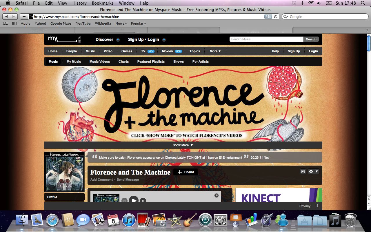
The myspace page is most obviously linked with the digipak in terms of the font. Both digipak and myspace banner uses the same font. Also there is reference to a heart, which could be linked with the lungs. Another way of having reference to the digipak is that her profile picture is the cover of the CD which would help the audience find her website. This is a good use of promotion.

The official website of Florence and the Machine has the obvious reference of the lungs as in the layout of the website has a pair of lungs where the navigation menu is. It also has the same font at the title "Florence + the Machine" and the same font that they had for the tracklisting etc for the other writing on the website.

The main examples being her myspace page and Florence and the Machine's official website:
The myspace page is most obviously linked with the digipak in terms of the font. Both digipak and myspace banner uses the same font. Also there is reference to a heart, which could be linked with the lungs. Another way of having reference to the digipak is that her profile picture is the cover of the CD which would help the audience find her website. This is a good use of promotion.
The official website of Florence and the Machine has the obvious reference of the lungs as in the layout of the website has a pair of lungs where the navigation menu is. It also has the same font at the title "Florence + the Machine" and the same font that they had for the tracklisting etc for the other writing on the website.

The genre is indie/ folk and the digipak gives a strong indication to the audience as what type of music is on the disk.
Digipak three: Ellie Goulding - Bright lights


Following this, it can be said that the theme of 'lights' are carried out through other platforms. For example, her video to "starry eyed" and her myspace layout.

No comments:
Post a Comment