
Showing posts with label Jasmine Bahrain. Show all posts
Showing posts with label Jasmine Bahrain. Show all posts
Monday, 9 May 2011

Tuesday, 18 January 2011
[EVALUATION] What have you learned from your audience feedback?
So from the feedback that we've had from the audience were incredibly successful and they've praised our video a lot, which is a positive reaction that we hoped to get.
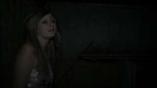
From the above video was a video reaction from the screening of our music video, she stresses that the video was fit for the genre and the use of mise en scene was great. She also liked the fact that we've gone far from the usual props and used dry ice which gives it a fantastic effect.
However some audiences also thought that improvements can be made to make this music video even better. For example, they thought the screen time for each character was heavily unbalanced. Even though the main character is Amy, the audience was curious about the mysterious Chesire Cat/Queen of hearts, while the Mad Hatter had a lot of screen time.
Ofcourse at the time our answer to this is the fact that our Cheshire Cat/Queen of Hearts character was actually heavily involve in creating the mise en scene and also the filming and the directing of the music video and therefore it was hard for her to be on screen all the time.
Another improvement was the fact that there was a cut off scene where the screen goes blank in between the song. We thought this would work well to create a hyped ending but apparently due to the reaction of the audience who MOSTLY thought that, that bit was the end applaused in the middle of the video.
So therefore we should've thought about taking that out for next time.
I think that by listening to people's feedback about our video we were very pleased with the outcome.
Overall in my own opinion this video (as if I was an audience myself) I thought that there were some scenes which are obviously used to fill in the blanks. This is due to the fact that we had shortage of time to film.
I think that if I have the chance to do this all over again, I would have planned the filming schedule better, in order to make sure we shoot EVERYTHING that we wanted, and also do other promotional issues such as a photoshoot for our digipack.
Click the link below for the written audience feedback.
Thursday, 13 January 2011
[EVALUATION] How did you use media technologies in the construction and research, planning and evaluation stages?
Websites used for planning, research and evaluation


These sites are the main sites that I used for planning and research. I use blogger obviously for blogging my work from start to finish. This site is important because it allows me to virtually keep my work in place and store it. I use Youtube to research music videos of other artist and give us inspiration for our music video. This site is useful because it gives us unlimited videos for any artists. For uploading our music video we have used Vimeo because the quality of their videos are significantly better than any other video providers.
Technologies used for filming

Editing Process


We used Final Cut Pro for editing because this is the best editing software for amateur film makers. The effects that we used were slow motion, cross dissolve and also we played around with the colours of the video.
You can read a full analysis of our editing process here editing process
For creating my ancillary texts, I used mainly Photoshop CS5 Extended
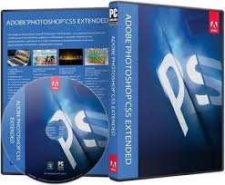
Plainly because this is the main software I use a lot at home. Also the fact that I can do a lot more than the normal Photoshop Ellements which are available college, for example creating an effective edit of a low quality picture takes a lot of skills to make it decent, and working with Photoshop Ellements does not work well enough to be able to do that. The reason why I decided not to use Quark Express is because I think there was no need to edit it there when I can use photoshop using a template and on photoshop I am fully in control of editing the image and the font.

Using Photoshop CS5 Extended version I was able to make a high quality GIF animation which would not be available if I used Photoshop Ellements or other photo editing softwares.

Digital storyboard.
[EVALUATION] How effective is the combination of your main product (video) and ancillary texts (digipack and advertisement)?

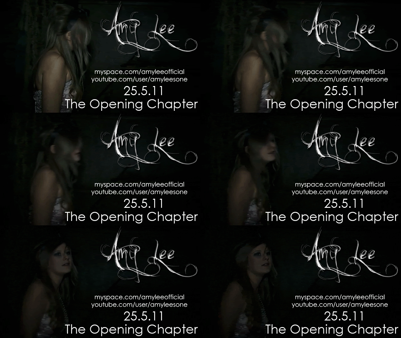

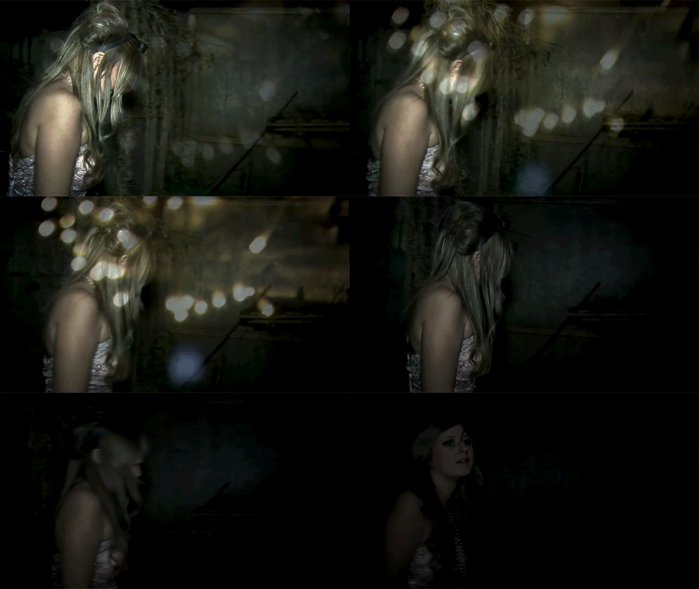
Screen shots from our actual music video



Monday, 10 January 2011
[EVALUATION] In what ways does your media product use, develop or challenge forms and conventions of real media products.


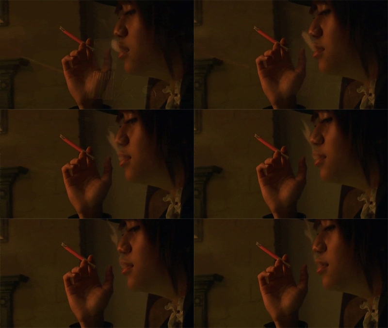
Digipack + Advertisement


I have used the idea of connecting the advertisment and also the digipack and music video to connect to together making an important tool to market my artists.
Wednesday, 5 January 2011
Final digipack
I've originally planned for a photobook style digipack but due to unforeseen circumstances I was not able to. However I've made a 4 panneled digipack instead because of the lack of clear and suitable pictures as we were unable to take another photoshoot with our artist due to schedule issues. I've kept the original concept of dark and mysterious but chic look which reflects our artist. I think that there are significant symbolic imagery seen in my digipack with the contrast of the colours and the mysteriousness of our artist Amy as in the front cover she's very much in the shadow giving it a huge contrast to her flowing pink dress.
The back cover of the digipack also uses a symbolic image by using the back of Amy and this relates directly to the music video which emphasizes on the correlation between advertising and music.
The inside of the digipack is simple yet effective. I've used an image that goes across both panels which is also directly related to the music video as it is a main prop. Also it fits with my mysterious, dark and chic concept. The information inside is plainly thanks messages because the information needed are all on the back cover of the digipack. I didn't want to overcrowd the inside because the image is too bold to put anything over it.
I've used a quote by Bob Dylan because I think that because she is an indie artist it is important that she expresses her thanks messages in a very meaningful way instead of saying thanks in a normal way that a pop star would have used.
I've used a quote by Bob Dylan because I think that because she is an indie artist it is important that she expresses her thanks messages in a very meaningful way instead of saying thanks in a normal way that a pop star would have used.
Advertisement


If you've noticed I've edited Amy Lee's name slightly different for each different medium of advertisement. For the GIF animation I've used a darker shade for my font with emphasis on embossing of the font to give it a 3D feel because it is directed at virtual advertising and therefore it would make it stand out a lot more.
For the billboard advert the emphasize is on the colour as it is greyer than the usual font I use because I think it fits the concept of my advertising because I wanted to focus on Amy Lee's image with the pink dress.
For the magazine or posters advert I've used a lighter shade for the font because I wanted to stand out as someone turns a page in a magazine or sees it on the street.
I think that by using different editing for each one gives it a fresh look each time a person sees it, but also keeping it familiar with the same image and layout and also most importantly the font which I think really represents the concept of our artist.
Monday, 13 December 2010
Short-list of fonts, colours, layout and design ideas
When looking for a font for our digipaks, we all had the same kind of idea that we wanted a swirly kind of font in order to keep the almost fairy tale element that the music video had. We used google to search for fonts and we came up with these fonts in our short list.


As you can see, all of these fonts are very swirly and flows well, making these fonts the ability to look great on our digipaks.We got the idea for the font 'chopin script' from when we tried to put titles on our music video. It worked well as a font, but with the video it didn't really look that good and the music video as a whole looked better without it, hence why it does not feature on the current music video. However, it is on our short list because if it looked good on the video as a font, then it could work on the digipaks.
As a group, we decided that we will decide individually on our colour schemes of our digipaks becuse each of us have very different ideas on what they want to achieve with their digipak. For example, one of us may want pictures of the tea party on the front cover, making their colour scheme very bright and colourful with a lot of pinks but another may want to feature the garden scenes which would make their colour scheme more monotone. In order for each of us to have our own mark on our individual digipaks, we thought it would allow us to be more creative with our work if we didn't share the same colour scheme.
As for layout we think that we are all going to create a 4 panel digipak however it is a distinct possibility that we will be individually creating a photo book to accompany the digipak. This is because we think it would be good to create a whole promotional pack for our artist and we can show off the mise en scene of our music video in its entirety, which no amount of panneled digipak could achieve. We will be using a mixture of stills from the video to tie the music video in with the digipak and photos which we will be taking of Amy so there are different elements to the digipak. This will show that even though there is strong reference to the music video, we are still trying to establish our new artist into the british indie rock scene.


As a group, we decided that we will decide individually on our colour schemes of our digipaks becuse each of us have very different ideas on what they want to achieve with their digipak. For example, one of us may want pictures of the tea party on the front cover, making their colour scheme very bright and colourful with a lot of pinks but another may want to feature the garden scenes which would make their colour scheme more monotone. In order for each of us to have our own mark on our individual digipaks, we thought it would allow us to be more creative with our work if we didn't share the same colour scheme.
As for layout we think that we are all going to create a 4 panel digipak however it is a distinct possibility that we will be individually creating a photo book to accompany the digipak. This is because we think it would be good to create a whole promotional pack for our artist and we can show off the mise en scene of our music video in its entirety, which no amount of panneled digipak could achieve. We will be using a mixture of stills from the video to tie the music video in with the digipak and photos which we will be taking of Amy so there are different elements to the digipak. This will show that even though there is strong reference to the music video, we are still trying to establish our new artist into the british indie rock scene.
Photos that may be used
We wanted to have some stills from the music video because we wanted to create a big link from the music video to the digipak and realistically, this is the best way to achieve this. Also there is so much mise en scene within out video with the tea party and everything, we thought it would be a shame if we didn't show it in our promotional packs. Here are some of the stills that we thought may look good in either the digipak or photobook because they show the mise en scene at its best.




Subscribe to:
Posts (Atom)