


The Masthead of the magazine 'NME' seems to be always placed in the left third of the front cover and it has a big and bold [put font here] font. This makes the name of the magazine stand out to the audience and with the white colour over the bold colours of the background (for example, the white over Florence's red hair) makes it stand out even more. By looking at these two front covers for NME, the main image tends to be a medium close up of the artist which the main story in the magazine is about. This enables the audience to directly relate the magazine to what genre of music they are representing and it lets fans of in this case, either Florence and the Machine or My Chemical Romance see that they are in the mag at a glance. This would gain the persons interest, most probably leading to the purchase of the magazine. The anchorage text is the text which accompanies the image which is there to attract potential readers. On both covers it is a quote from the inside story. The first cover's one is "We loathe what goth has become" and the second says "I would have never got through the X Factor auditions". These are both in capital letters which is done to make it stand out and grab the potential readers attention. The cover lines are positioned at the side of the cover which explains what other bands and artists that are featured in the magazine that week. This is featured in order to inform the potential reader of what else they can find in that particular issue. On the first cover, there is a mini advert saying that there are free posters inside, this is done in order to give the reader more of an incentive to buy the magazine. These covers, just like every other magazine has the issue number, date of issue, price and barcode. NME is a magazine that typically promotes indie and rock music and it grabs the target audiences attention by carefully planning out their design of their front covers.

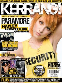
The masthead is black and white by default on every issue of Kerrang! Magazine and they go together to make it stand out from the rest of the magazine. For example, if you look at the second cover, the black strip behind the white masthead, it sets it apart from the rest of the magazine. With some issues (like cover one) not all of the masthead can be seen which could suggest that this particular masthead can be recognised easily. The font is "cracked" which can suggest that the music in the magazine is loud - shattering the masthead. It could also be made as a reference that its a rock/metal/heavy metal music magazine. The main image tends to be a mid shot showing the artists top half of their body. The Anchorage text is bigger than the masthead text with a simple block capital font. This is used in order to grab the potential readers attention. Kerrang magazine has both a skyline which normally has an exclusive written on it, whether its the exclusive news or a not to be missed competition. It also has a cover line at the bottom, showing what other bands/artists that are featured in that particular issue. Both of these work in order to grab the potential readers attention. On both covers, there are mini adverts saying that there are free posters inside, this is done in order to give the reader more of an incentive to buy the magazine. These covers, just like every other magazine has the issue number, date of issue, price and barcode. Kerrang! magazine promotes mainly rock, metal, punk and heavy metal artists/bands.
No comments:
Post a Comment