Friday 17 December 2010

Booklet planning

Here are the photos that I think I would like to have in my booklet which will accompany my digipak. The photos consist of the music video as a whole - the reasoning behind this is that I would like to incooperate as much of the video within the digipak as possible. Not only do I think that it would be a shame to put all the mise en scene of the video to waste when it came to the digipak, but also I think it would create a strong reference point for the audience when the pick up the digipak. The digipak will have a strong link to the music video which would be good when it came to the promotion of the new artist. See below for the pictures. (click picture to enlarge it.)


While I have not fully decided if all these pictures will be used, the key pictures which show more of the music video in relation to introducing the characters in the music video, including the artist and the key props that are featured in it will be shown in the photobooklet.

Tuesday 14 December 2010

Analysis of advertisements

Television Advert 


Online banner advertisement
Magazine advert
Here are three types of advertisements used to promote Marina and the Diamonds debut album. They all show a continuity of font which allows the audience to identify the font with the artist. Also all three advertisements feature the artist which creates reference between the adverts and her music videos. The youtube video and the website banner shows that her record company are trying to do viral advertising over the internet which is becoming more and more popular in the industry. Also the poster would be featured in magazines, which will promote her to a specific audience. For example, if it was featured in NME, it is more likely that her target audience would get to see this advert, rather than if it was in a rock magazine such as Kerrang! magazine. The advert gives information on its release date and what singles are on there, which is what the HMV advert has. This shows that continuity is needed in order for the audience to recognise the artist.

Do's and don't s of design work

When designing my mock up for my digipak, I had to take many things into consideration. Here is a list of things which I knew I would have to consider when designing my digipak:
Do's:
- Use a clear font.
- Use appropriate sizes for both images and fonts.
- Use clear, in focus images so the audience can see at a glance.
- Use photos that are an appropriate shape for the page.
- Use a layout that follows the rule of thirds for composition when taking photographs.
- Use an appropriate type face that follows genre conventions and a particular style.
- Be careful where you place the font. The font should follow genre conventions and be clear from a distance.
- Follow the conventions of the three colour rule and use colour that is appropriate for images, font and background.
- Use appropriate industry logos and conventions, properly positioning the barcode, date, copyright, titles and artist names.

Dont's:
 -Stretch images
- Use layer styles 
- Use unnecessary effects that do not suit the genre
- Use a font just because you like it. What you may like, may not fit in with the target genre and therefore the target audience.
- Feel like you need a different photo for every panel. Be creative in what you are doing.

Digipak analysis


This is the digipak for Lily Allen's latest album "Its not me, its you" the special edition version. The font and size of the artists name is different to the title of the album which could mean that here, the artists name needs to be shown more instead of the title because there is not a close up of Lily Allen or anything like that so the audience can recognise it from far away. The back uses the same idea of the big block letters and showing the side of them, showing different colours. This shows that there is a link from the front of the CD to the back of it. On the back there is the normal copyright things, production and record label information with the barcode and her website. The font of the artists name is linked with other promotional platforms that Lily Allen has. For example, her website logo. (see below) It also links with the CD covers of the singles that have been brought out from the album.
Another digipak is Paloma Faith's "Do you want the truth or something beautiful?"

The same font is used for all the writing on the album, however the title of the album is a smaller size, showig the difference between the artists name and the title. The font is linked to the font that is used for the artists name on all of her promotion platforms, just like Lily Allen's. Reference to the albums title is made here as there are things within the image which some people deem as 'beautiful', in this case, it is the rose's and white doves. The colour scheme of the album is very bright, involving shades of blue. This adds to the effect of things of beauty. The writing is put in the corners of the image which gives it the impression that all the attention is on the artist and the image itself, rather than the title of the album or the artists name, giving it a kind of 'show performance' element to it.

Florence and the Machine - Lungs

The front cover has a direct reference to the album’s title as you can see a pair of lungs on top of Florence’s chest. The lungs happen to become an iconic feature accross the rest of the digipak as on the back cover there is a diagram of a pair of lungs that looks like it is being analysed. Each number that is at the end of each branch is referenced to a track listing, suggesting that the songs make up the pair of lungs are are a part of them. The reference of lungs and other organs of the sort are used throughout her promotional platforms like her official website and her myspace. (see below)


Monday 13 December 2010

Short-list of fonts, colours, layout and design ideas

When looking for a font for our digipaks, we all had the same kind of idea that we wanted a swirly kind of font in order to keep the almost fairy tale element that the music video had. We used google to search for fonts and we came up with these fonts in our short list.


 As you can see, all of these fonts are very swirly and flows well, making these fonts the ability to look great on our digipaks.We got the idea for the font 'chopin script' from when we tried to put titles on our music video. It worked well as a font, but with the video it didn't really look that good and the music video as a whole looked better without it, hence why it does not feature on the current music video. However, it is on our short list because if it looked good on the video as a font, then it could work on the digipaks.

As a group, we decided that we will decide individually on our colour schemes of our digipaks becuse each of us have very different ideas on what they want to achieve with their digipak. For example, one of us may want pictures of the tea party on the front cover, making their colour scheme very bright and colourful with a lot of pinks but another may want to feature the garden scenes which would make their colour scheme more monotone. In order for each of us to have our own mark on our individual digipaks, we thought it would allow us to be more creative with our work if we didn't share the same colour scheme.
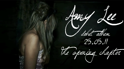
As for layout we think that we are all going to create a 4 panel digipak however it is a distinct possibility that we will be individually creating a photo book to accompany the digipak. This is because we think it would be good to create a whole promotional pack for our artist and we can show off the mise en scene of our music video in its entirety, which no amount of panneled digipak could achieve. We will be using a mixture of stills from the video to tie the music video in with the digipak and photos which we will be taking of Amy so there are different elements to the digipak. This will show that even though there is strong reference to the music video, we are still trying to establish our new artist into the british indie rock scene.

Mock Up of adverts


Here are two examples of what I thought could make a good advertisement for our artist. With the font, I don't really think I will be using this exact font, but the basis of how curly I would like the font to be is there. I have used stills from the music video here in order to create a direct link from the music video to the advert. My favourite out of the two is the second one because it is such a memorable scene in the music video, not only would it be an obvious link to the video, but the way the lights intergrate with Amy is really pretty and a good use of colour. However, if I wanted to make an even more obvious reference to the music video, I would have to use a still from the tea party because it is such an iconic scene which is carried out thrughout the video. A photoshoot with Amy is going to be taking place on sunday, so once that is done, I will have another opportunity to make some more designs for the advertisement.

Photos that may be used

We wanted to have some stills from the music video because we wanted to create a big link from the music video to the digipak and realistically, this is the best way to achieve this. Also there is so much mise en scene within out video with the tea party and everything, we thought it would be a shame if we didn't show it in our promotional packs. Here are some of the stills that we thought may look good in either the digipak or photobook because they show the mise en scene at its best.


Sunday 12 December 2010

Notes and Mock up of Digipak

When planning what would be in my digipak and the photo book that I intend on creating, I made a list of notes such as what info needs to be included in what places and what else could be featured in the photobooklet. For example, I have written a draft of what will be said in the Thank you's and also if I decided to put a mini biography of the artist in the book, what that will say as well. Here are photos of what I put in my notes. (click to enlarge image)


Here is a mock up of what my four paneled digipak will look like. The inside image will run over the whole two panels to show a continuity through the digipak. (click to enlarge)

Mock up of advertisement

Digital advertisement.
I will create a gif animation from the video which will be put up on social networking sites such as myspace, tumblr, forum sites and the official Amy Lee website.

This is a mock up of a billboard advert for Amy Lee. 

As you can see there is a consistency of the fonts used, and the mood of the advert which reflects our artist's concept. I will do a photoshoot with Amy in order to get the perfect image for her advertising and also digipack. 

Monday 6 December 2010

Mock up of group digipak


This is a mock up of our "digipack"

It is a photobook style digipack inspired by the Kpop industry which does a similar layout for their CD packs. We've decided to do something like this because we feel that the lack of originality in normal digipacks makes the customer (target audience) reluctant to buy the CD, because they could always download the songs online. So by making the CD pack unique with a photobook that consist the photos of the artists and mise en scene from the music video which makes it a great tool for marketing. We are giving our target audience a collectable item instead of just a normal CD pack. This mock up consist of some rough photos that we might use, but this is only to show the layout of the digipack. 

For our final digipack it will contain not only exclusive photos, but lyrics, and other informations about Amy (our artist) which will be decorated graphically to show the concept of our artist.

this is Jasmine Bahrain's mock up of front and back cover of digipack

This is a link to Kelly Drury's mock up of her digipack

This is a link to Yasmin Phillip's mock up of her digipack
(insert link here)

Sunday 5 December 2010

Overview of do's and don't' of designing work

From seeing the advertisements for other artists I have come to a conclusion that there are some rules on how to make my advertisement effective. The following are the basic simple rules to follow when creating my advertisement:

Do's:
* Use a clear font.
* Use appropriate sizes for both images and fonts.
* Use clear, in focus images so the audience can see at a glance.
* Use photos that are an appropriate shape for the page. You wouldn't want a portrait photo for a landscape page.
* Use a layout that follows the rule of thirds for composition. This has to be taken into account when taking the pictures.
* Use an appropriate type face that follows genre conventions and a particular style.
* Be careful where you place the font. The font should follow genre conventions and be clear from a distance. This will make sure that the audience can tell what type of music is being sold just by looking at the cover.
* Follow the conventions of the three colour rule and use colour that is appropriate for images, font and background.
* Use appropriate industry logos and conventions, properly positioning the barcode, date, copyright, titles and artist names.


Dont's:
* Stretch images
* Use layer styles
* Use unnecessary effects that do not suit the genre
* Use a font just because you like it. What you may like, may not fit in with the target genre and therefore the target audience. 
* Feel like you need a different photo for every panel. Be creative in what you are doing.


Analysing advertisments

Billboard advertisment

Digital advertisement

TV advertisement


The three forms of advertisement are all for Florence + The Machine's advertising campaign. Her record company "Islands Records" have made sure that her target audience are ought to see her everywhere they are, from being on the bus looking at her billboard, to the TV while they're watching their favourite show they'd see the advert and to the digital advertisement seen on the artist's website or on spotify or facebook. These are examples of effective advertisement, because it targets all the right locations and it sticks in people's mind as it relates to the album and the concept of the artist. It all have the iconic image of Florence (the artist) and Lungs which is the name of the album.

The advertising continues with Florence's myspace page

All these advertising have in common is the fonts, the image and the lungs.
For my advertising, I will have to make sure that I keep a continuous effect for all the advertisement as it ties in with the whole concept of my artist, along with the font, image, and mood. As this plays a huge part in attracting my target market