After looking at many videos i found myself really enjoying watching the videos that included more obscure mise en scene.
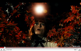
This scene gave me the idea of a very theatrical looking table, i wanted the whole of the table to be covered in candles ad lights, the candle holders and seating of this scene in particular gave me ideas for placement of props.
As a whole the video influenced the idea of a journey, our journey had Amy waking from a dream and theres had a boy being placed into a different world trying to find the end in a book.
You can clearly see the link between our mise on scene and the mise on scene in the Used Video.
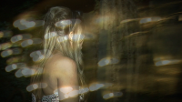
these screen shots from the original video show the elements that we picked out to use in ours. the lights were very important and i found that with the sound at the end they matched so well so we tried to replicate the effect through wrapping fairy lights around my kitchen table and using editing to brighten and darken the background.
at the ending of the song the atmosphere changes and it gets very soft and calm and the movement in witch florence moved was very relevant and graceful, we focused in on her face however how we did it was we slowed down the motion of her walking and when she turnes we filmed her flinging back her hair, we used a cross disolve with the lights to have a more interesting and complex image on the screen.
 Florence and the machine was also a small influence when it came to the video, although this is the song we chose for our final song choice we didn't use to much of the original and we just picked out elements that we found particularly interesting.
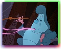
  Alice and wonderland was also a huge element that we based our whole project on, the main characters that we included was the mad hatter (who we also took some character reference from a clockwork orange), the queen of hears witch we mixed in the cheshire cat, and alice who amy played.
we used the tea party as our main focus with cups and saucers, bright cakes and tea pots scattered around the table.

When it came to insparation for the look of the digipack i knoew that i wanted a bold image on the front cover, when i think of bold i think of lady gaga, i looked at some of her album digipacks and i liked her crouching position, i then saw a fan made cover and i loved the dark edges so i then added it to my digipack front cover.


No comments:
Post a Comment