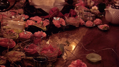
I've edited some of the pictures taken from filming. I had a hard time editing these pictures to a "decent" standard because the camera was not appropriate for the image that I had in mind. So by editing the colours really dark and blurring out the pictures I get a more mysterious and dark Alice in Wonderland. Playing around with the saturation and hue of the image is important to get the right colour which contributes to the mood of the picture. I didn't want to get just an image to represent the artist. I wanted the colour and the feel of the picture to represent the artist which is why I didn't want the typical full face pictures of our artist Amy. I also think it makes it look edgy and mysterious.


No comments:
Post a Comment