Friday, 26 November 2010

analysis sequence from the rough cut


this was a scene where our main character Alice did a sequence of putting in normal bread into a toaster but it comes out with this pink bread with 'EAT ME' written on it. 
There was a lot of complaints about this scene in particular because we focus on every single detail of mise en scene in our Music video. So the Warburton bag was a complete off point because it just puts off the idea of mystical and dreamy scene. However I think that the original idea was to contrast the reality and fantasy, and so we thought the Warburton bread bag represents the reality and when she puts it in the toaster, our main character Alice is exposed to the fantasy of the pink bread. But we've decided to take it out because we think that it spoils the whole concept of our video and therefore this was a scene that was not needed and had to be cut.

Analysis of a sequence from the rough cut


Here is a part at the beginning when 'Alice' goes down into the kitchen to make breakfast by putting in ordinary bread in a toaster and it comes out as pink bread saying "EAT ME". In the editing process for this, we changeed the lighting of the footage to make is more dull and used the cross dissolve effect on Final Cut Pro to create the way it looks in the video above. The idea of the toast magically changing was good, however, the footage at the start where Alice takes the bread out did not work. The bread packet was so close and in focus to the camera, it distracted the viewer from what was really happening, meaning that it was a very poor use of mise en scene. It wasn't just the teachers who said this, but also most people who we got feedback from (when it came to the rough cut - referring to the blog posts below). By taking all this into account, we as a group felt that we had to get rid of it and it is gone for the better. The video works better witthout it and when you see the final edit of the video, the footage that we have replaced it with works so much better.

Monday, 22 November 2010

Gifs from rough cut


these two have been edited to fit tumblr's gif policy of being under 500KB size wise. So therefore I had to play around with the saturation of the gifs and also the size and frames. When I make an official tumblr site for my artist I will need to remember to edit it to the right standard so that it would work on tumblr. 
However on other sites for example on forum sites or myspace there are no limits on the Gif size


Friday, 19 November 2010

Feedback from audience

Along with the detailed feedback from Susuana Abena, I got some comments from others about what they think of the rough cut of our music video. I asked people who I believed would be our intended target audience if this music video was to go viral (or via different distribution). I linked people to our rough cut on the social network facebook in order to get these opinions.
Here is what some people said:
Juliana Amaa: "Its an elegant piece of multimedia, however, I would like to see more of the other characters within the music video, the prime example being The Mad Hatter. But thumbs up for the quintessentially british music video."

Amber Griffith-Monk: "I like :) 
Obviously there are reasons for everything you decided to do so feel free to ignore any of this:
I really love all the dry ice shots (forwards and backwards!), partly due to the skillful shots and partly because I'm a child who shrieks "oooh dry ice" when I see it.
The first 50 seconds have a really good feel to them (*is bad at expressing opinions*)
It definately has a dreamy feel so well done!
I'd probably like to see more jump cuts (*attempts technical jargon*) in the rocky bits because the flickering mad hatter was really good and some of the slow fades (while dreamy) don't quite fit the pace of the music in some parts."

Talisa Legon: "Brad [her boyfriend] and I watched and we think it's good! I love it and good song choice! I love how smoothly everything flows and the scenery, with the cakes and smokes. The only thing Is I think the toaster and the bread packet didn't quite fit in with the alice in wonderland theme. Just a minor detail. Everything else is so cool. The people in it was good and the way they smiled. Really good video." 

Note: from this feedback, we can now realise that we are right in taking out this shot in the music video because as expected, the audience may find it distracting and out of place, like how Talisa did.

Henna Haroon: "Wowww that was sooo amazing me and my mate Zoe just watched it and she even said its really good. I just love the effect and the smoke. And how its so colourful, it really fits in with the song. Well done - I'm in love with it!!! Good job dude so pleased. xxxxxxxxxxxx"


Robyn Griffiths: "I love the whole concept and idea Kels well done to you and your group :)
My only criticism is the whole bread and toaster thing like Talisa said but you said you're gonna fix that bit up so just ignore me lol
Quick question though...what did you do with the cupcakes after filming? haha x x"


Kim Francis: "Its really good, I prefer it so much more than the original to be honest. I thought the whole effect with the dry ice and everything made the video look dreamy (if thats the right word) and mystical. The idea that it was a different, kind of magical world came across to me and I liked the was the setting [mise en scene] achieved this. My favourite parts was the middle part with the girl and the fairly lights merging together and also the part with the candles and the bits of the two other characters. However, the Toaster part where I can see the bread packet could be changed. It just looks a bit weird compared to all the other parts in the music video. Overall I really like it."

Tamara (who is in another group in my class): "I can't stress how incredible this is. 
I really like the contrast of colours in the scenes, some scenes have been edited with a softer colour?
The shots are really well done, you'd think that perhaps by moving the camera to give it a "dreamy" effect would look a little tacky, but you managed it as it's really subtle and gentle. The only thing is the bread bag, (which I’m sure you get a lot of people saying) which doesn’t really blend well, considering the elegantly iced cupcakes. The use of props makes the video look realistic, as if the whole thing is real, not just been planned and shot. It would have been nice to see the other characters for a tad longer as you know who they are, but only see them for split seconds. 2:32 – 2:34 I found when the fade ended it was a little sharp? It just abruptly stops, making it look a little weird.
But overall I think this is a really amazing piece of work so far. The ending is LOVELY. LOVE THE LIGHTS….Can’t wait for the speech ;D"

Thursday, 18 November 2010

Audience feedback

Here is a video of the audience feedback for our rough cut of our music video


Here are the words most used by our audience feedback


I have also had a review done by Susuana Abena of last year's A2 who also done a music video for this course

"Group 3 rough cut feedback
The Intro to the video suits the song with its Noir Dreamlike qualities. The quick Cut is to the Medium Close up doesn’t suit the mood in my opinion but then again it is a rough cut but the effect the hand held camera gives. The unusual and eye catching smoke effects along with the change of focus engages the viewer and at the same time creates a confusing and intriguing display.

As the song moves into the next part, the editing mirrors the drum beats which I think is very effective in the way it shakes up the mood. The part when she goes down the stairs would be better slowed down but it may have to be cropped if it was intended to happen within a specific time. The toast sequence is interesting but I don’t feel it is on as higher level as the rest of the video, effective editing will probably bump it up though.

The mise en scene is amazing and many of the best shots are of the table decorations and displays excellent framing skills. I feel the pan of the table would have been more effective a little slower too. The Slow motion in Bridge is perfect for the song but I think it would be better if something else was faded in the second time instead if the repeated fairy lights again. You wouldn’t want to make it look like you ran out of shots to use either.

The smiling Cheshire cat and the fairy lights shot is a great ending. Reminds me of a darker version to the music video for “In sleep” by Lissie” which uses lots of dreamy fairy light shots and might be useful for transition ideas ie (flashing lights).

The dark Alice in wonderland theme worked the song; considering the countless interpretations of Alice and Wonderland, I like the way you created your own twisted version and made it your own. I think the music video so far is great, and it needs little more to be perfect."

I think that her opinion is needed because she's done her music video last year and so this help us by giving us tips on how to make our music video better. 

Rough Cut


There are a few things that need to be tweaked to this video. 
For example:
1) The scene with the toaster needs to be tweaked because the bread bag is right in the middle of the shot and distracts the viewer, therefore making it a poor use of Mise en Scene.
2) The shots where the candles are shown and the mad hatter eats the pink bread needs to be extended so it is shown more.
3) The scene at the end where Amy runs out of the room needs to be reviewed as it doesn't look that great as it is.

After this, we will review the video as a whole before we put the titles in. Also we need to make the music fade at the end so it doesn't end abruptly like it does here in the rough cut.

Here is a better quality version of the rough cut:

Saturday, 13 November 2010

The Editing Process

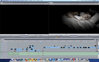
Now all the filming has been done, we have been editing the music video together using Final Cut Pro and we have been doing this for the past few weeks due to our filming being successful first time round. It has been quite hard to get everything in sync with the music and keep things to the beat. Also we have found it hard to find the right bits of footage to put in the music video because we filmed so much, we had so much to choose from. Below are some screen caps of how our editing has been going along.


We have been editing using the Mac's with double screens which has been very helpful in making the whole process easier to do (due to more screen space). See the two images above for how each screen was layed out.


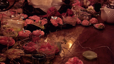
Here we were using the slow motion and cross dissolve tool to merge the two bits of footage (Amy in the garden and the lights on the table).

As it stands, we have about 40 seconds or less to do of the music video and we intend on doing this before the rough cut deadline which is the end of next week. Then after taking feedback from people, we will be making final tweaks and also adding the text to the parts where each character is talking using LiveType.

Wednesday, 3 November 2010

Edited pictures for digipack


I've edited some of the pictures taken from filming. I had a hard time editing these pictures to a "decent" standard because the camera was not appropriate for the image that I had in mind. So by editing the colours really dark and blurring out the pictures I get a more mysterious and dark Alice in Wonderland. Playing around with the saturation and hue of the image is important to get the right colour which contributes to the mood of the picture. I didn't want to get just an image to represent the artist. I wanted the colour and the feel of the picture to represent the artist which is why I didn't want the typical full face pictures of our artist Amy. I also think it makes it look edgy and mysterious. 

Monday, 1 November 2010

Make up planning


When doing the make up for the characters in or music video, we used a range of things to inspire each look.
For example, with Jasmine's character (The Mad Hater), we used the theme of the film A Clockwork Orange and the main characters make up. The trailer of the 1971 film is below.
We researched how to achieve this look by looking at a range of GIFs, images and youtube make up tutorials. This enabled us to create the right look that we wanted for out mad hatter. Examples of this is below.

When we done the make up for the mad hatter, we created the look mainly by using eyeliner and fake eyelashes. These two basic steps ensured the correct and realistic 'A Clockwork Orange' look.

For Amy's make up, we wanted to achieve a smokey eyed look by using mainly the colour black. Even though Yasmin knew how to create this look already, we decided to look at other tutorials online to make sure that we would correctly achieve what we wanted in Amy's look. This was because we wanted it to show that she was wearing make up, but more in a natural way rather than a dramatic way. 
We looked at this tutorial by panacea81 who is a well known make up artist on youtube and has also appeared on day time television such as This Morning, doing her tutorials. Here she is imitating the smokey eyed look that Effy from the TV Drama Skins, however it is close to the look we wanted to achieve with Amy.


We also had a look at this quick tutorial on how to create the same type of look. However, we didn't really like this tutorial as it seemed a bit too basic, so we stuck mainly with the first tutorial as inspiration and Yasmin's skills that she already had when creating the look.