The feedback from the cinema was very positive and many people enjoyed watching it. The things that people found were interesting were the scenes with the dry ice, because dry ice is so difficult to get hold of and isn't the most commonly used student prop it looked very interesting.
Many people commented on the use of the lighting and how well we used it.

Showing posts with label Yasmin Phillips. Show all posts
Showing posts with label Yasmin Phillips. Show all posts
Monday, 17 January 2011

evaluation question three


Tumblr was also a great website that was used an awful lot when it came to finding ready made moving images to place on to the blogs.
Wikipedia was used when we were in the first stages of the project and we were finding out information about the artists such as florence. Using wikipedia we researched florence, looking at her recent releases, labels, genre and how her music relates to her audience.
Blogger was the main site that was used to log all our planning and thoughts on our work, blogger i found out of all of the technologies used was the easiest and simplest to use, embedding videos and uploading pictures only took a click. However i found that some of the time it could be slow and take a while to upload videos, which i found frustrating at times.
The equipment that we used was quite extensive.
We carefully planned out the whole day and what equipment we would need to do a whole day shoot at my house. this contained:
2 lighting kits
2 HD profesional cameras
2 light attachments for the camera
4 batteries
4 battery packs for the lighting kit
1 still camera
3 memory cards
The whole day ran smoothly and we didn't hit any problems except when we started lighting each of the set we forgot to include in our equipment the plug attachment for lighting indoors, with limited amounts of battery we had to choose to light our scenes wisely, only having them plugged into the battery packs when it was completely necessary. At the end of the day we had completely run out of light and we had to improvise with candles, torches and we attempted to use the light attachments that came with the cameras.
After a few test shits with the camera lighting attachments we decided not to use them because of the colour of the light, the light gave everything a bright white and blue look that didn't quite match our mise on scene.
Because of the amount of footage that we shot , our originally planned outdoor scene had to be scrapped because we ran out of light and memory.
Although we didn't have all the scenes that we planned i think we did the best with the equipment that we had on the day.
 Final cut was the program that i used for the most of the project. Editing the video was quite challenging because we used a huge selection of different effects. when watching the footage back when i was beginning to edit i decided that i wanted the colours a little less bright so that it would directly contrast with the rest of the video. in order to do that i used the colour correction 3 way and lessened the saturation of the colour and added a few blue and green hues to the scene, i directly copied all of the attributes to the rest of the beginning footage of her being asleep. because of the lack of colour in the first section of the cut i brightened some of the pinks and blues in the rest of the video.
We used a lot of transitions throughout or film and the main one was the cross cut, by placing our scenes above each other and fading in from one and to another it gave it a more dreamy effect to the final edit.
We also used the cutting tool to create some very quick cuts to introduce the mad hatter in what seemed to look like strobe flashes by leaving small spaces in between the scenes. Because we had very few lip synced scenes in the whole video the first section we had to mark and also mark the song, it took a while to get everything in line and in sync but in the end it matched almost perfectly.
Many of our scenes were either sped up or slowed down in order to create a consistent motion throughout the video, with the ending being more relaxed and at a slower pace i decided to just use two images, i used the scene of amy walking away from the house and the flashing lights and a cross cut to dissolve the two together. By doing this it created a slow movement with the lights brightening and dimming at some points, the lights added a whole new dimension to the scene and by dissolving it before she turned her head it really gave a focus on Amy's expression in the final few seconds of the dreamy music before it hits the chorus.

For my digipack i used quark. Before using quark i used photoshop to change the saturation and hue of most of the images to give it a photographic look rather then a scene taken straight out of the film, i found quark quite easy to use and it didn't take me long to add the text using text boxes and change the colour and size. Images were also very easy, with just a double click it gave you the option to upload the image in the right place witch i found so much better then using photoshop.

Our anamatic storyboard was created to give a brief outline of our video, using images from our influences such as a clockwork orange and alice and wonderland. Our anamatic was created in Final cut pro, we took photographs using a still camera from images we had collected and uploaded the file into final cut pro, after doing that we dragged them all onto the timeline and shortened the amount of time each was on and put them in order, we converted the film on to a quick time movie and uploaded it on to the blog.
evaluation question two


I think that my digipack and my music video links directly mainly because all images used were taken directly from the final video. The reasons for me doing this is because i found that the mise en scene played such a big part in the video it would be a shame not to waste the effort that was put into making all the frames packed full of interesting objects.
In photoshop i made a few changes to the images such as adjusting the lighting to give it more of a photographic look rather then the image looking like it was taken straight from the film. My front cover was taken from footage that we didn't use in the final edit, the footage was not suitable for edit because of the lack of movement in the frames, however as a still the image was quite striking, Amys was in a crouching position by a tree and with a bit of brightening of the dress and the editing out of some of the trees to make way for the text the image looked suitable for the front cover of my digipack. overall i think that the digipack was simple but effective in its use of imagery.
The links that my digipack and my advert have is that the font is exactly the same and the front image is the same.
evaluation question one
Mise en scene was the main focus when i was thinking of ideas for our video.
After looking at many videos i found myself really enjoying watching the videos that included more obscure mise en scene.
 This scene gave me the idea of a very theatrical looking table, i wanted the whole of the table to be covered in candles ad lights, the candle holders and seating of this scene in particular gave me ideas for placement of props.
 As a whole the video influenced the idea of a journey, our journey had Amy waking from a dream and theres had a boy being placed into a different world trying to find the end in a book.
You can clearly see the link between our mise on scene and the mise on scene in the Used Video.
 these screen shots from the original video show the elements that we picked out to use in ours. the lights were very important and i found that with the sound at the end they matched so well so we tried to replicate the effect through wrapping fairy lights around my kitchen table and using editing to brighten and darken the background.
 at the ending of the song the atmosphere changes and it gets very soft and calm and the movement in witch florence moved was very relevant and graceful, we focused in on her face however how we did it was we slowed down the motion of her walking and when she turnes we filmed her flinging back her hair, we used a cross disolve with the lights to have a more interesting and complex image on the screen.
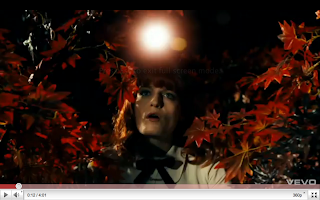 Florence and the machine was also a small influence when it came to the video, although this is the song we chose for our final song choice we didn't use to much of the original and we just picked out elements that we found particularly interesting.
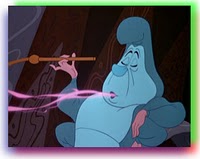
 Alice and wonderland was also a huge element that we based our whole project on, the main characters that we included was the mad hatter (who we also took some character reference from a clockwork orange), the queen of hears witch we mixed in the cheshire cat, and alice who amy played.
we used the tea party as our main focus with cups and saucers, bright cakes and tea pots scattered around the table.



 When it came to insparation for the look of the digipack i knoew that i wanted a bold image on the front cover, when i think of bold i think of lady gaga, i looked at some of her album digipacks and i liked her crouching position, i then saw a fan made cover and i loved the dark edges so i then added it to my digipack front cover.
After looking at many videos i found myself really enjoying watching the videos that included more obscure mise en scene.

You can clearly see the link between our mise on scene and the mise on scene in the Used Video.

 Florence and the machine was also a small influence when it came to the video, although this is the song we chose for our final song choice we didn't use to much of the original and we just picked out elements that we found particularly interesting. Alice and wonderland was also a huge element that we based our whole project on, the main characters that we included was the mad hatter (who we also took some character reference from a clockwork orange), the queen of hears witch we mixed in the cheshire cat, and alice who amy played.
we used the tea party as our main focus with cups and saucers, bright cakes and tea pots scattered around the table.


Thursday, 6 January 2011


Tuesday, 14 December 2010
Analysis of advertisements
Television Advert
Online banner advertisement

Magazine advert

Do's and don't s of design work
When designing my mock up for my digipak, I had to take many things into consideration. Here is a list of things which I knew I would have to consider when designing my digipak:
Do's:
- Use a clear font.
- Use appropriate sizes for both images and fonts.
- Use clear, in focus images so the audience can see at a glance.
- Use photos that are an appropriate shape for the page.
- Use a layout that follows the rule of thirds for composition when taking photographs.
- Use an appropriate type face that follows genre conventions and a particular style.
- Be careful where you place the font. The font should follow genre conventions and be clear from a distance.
- Follow the conventions of the three colour rule and use colour that is appropriate for images, font and background.
- Use appropriate industry logos and conventions, properly positioning the barcode, date, copyright, titles and artist names.
Dont's:
Do's:
- Use a clear font.
- Use appropriate sizes for both images and fonts.
- Use clear, in focus images so the audience can see at a glance.
- Use photos that are an appropriate shape for the page.
- Use a layout that follows the rule of thirds for composition when taking photographs.
- Use an appropriate type face that follows genre conventions and a particular style.
- Be careful where you place the font. The font should follow genre conventions and be clear from a distance.
- Follow the conventions of the three colour rule and use colour that is appropriate for images, font and background.
- Use appropriate industry logos and conventions, properly positioning the barcode, date, copyright, titles and artist names.
Dont's:
-Stretch images
- Use layer styles
- Use layer styles
- Use unnecessary effects that do not suit the genre
- Use a font just because you like it. What you may like, may not fit in with the target genre and therefore the target audience.
- Feel like you need a different photo for every panel. Be creative in what you are doing.
- Use a font just because you like it. What you may like, may not fit in with the target genre and therefore the target audience.
- Feel like you need a different photo for every panel. Be creative in what you are doing.
Digipak analysis


This is the digipak for Lily Allen's latest album "Its not me, its you" the special edition version. The font and size of the artists name is different to the title of the album which could mean that here, the artists name needs to be shown more instead of the title because there is not a close up of Lily Allen or anything like that so the audience can recognise it from far away. The back uses the same idea of the big block letters and showing the side of them, showing different colours. This shows that there is a link from the front of the CD to the back of it. On the back there is the normal copyright things, production and record label information with the barcode and her website. The font of the artists name is linked with other promotional platforms that Lily Allen has. For example, her website logo. (see below) It also links with the CD covers of the singles that have been brought out from the album.

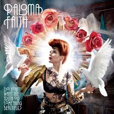
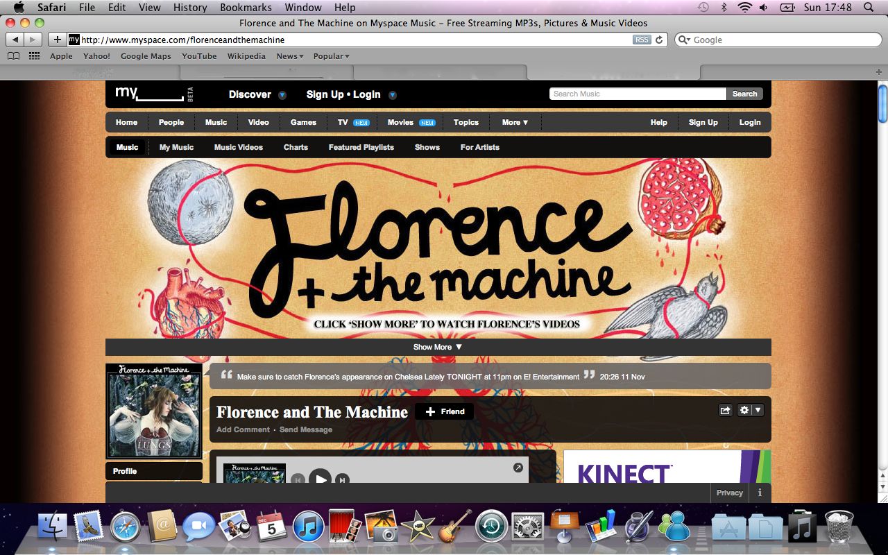
Florence and the Machine - Lungs



Monday, 13 December 2010
Short-list of fonts, colours, layout and design ideas
When looking for a font for our digipaks, we all had the same kind of idea that we wanted a swirly kind of font in order to keep the almost fairy tale element that the music video had. We used google to search for fonts and we came up with these fonts in our short list.


As you can see, all of these fonts are very swirly and flows well, making these fonts the ability to look great on our digipaks.We got the idea for the font 'chopin script' from when we tried to put titles on our music video. It worked well as a font, but with the video it didn't really look that good and the music video as a whole looked better without it, hence why it does not feature on the current music video. However, it is on our short list because if it looked good on the video as a font, then it could work on the digipaks.
As a group, we decided that we will decide individually on our colour schemes of our digipaks becuse each of us have very different ideas on what they want to achieve with their digipak. For example, one of us may want pictures of the tea party on the front cover, making their colour scheme very bright and colourful with a lot of pinks but another may want to feature the garden scenes which would make their colour scheme more monotone. In order for each of us to have our own mark on our individual digipaks, we thought it would allow us to be more creative with our work if we didn't share the same colour scheme.
As for layout we think that we are all going to create a 4 panel digipak however it is a distinct possibility that we will be individually creating a photo book to accompany the digipak. This is because we think it would be good to create a whole promotional pack for our artist and we can show off the mise en scene of our music video in its entirety, which no amount of panneled digipak could achieve. We will be using a mixture of stills from the video to tie the music video in with the digipak and photos which we will be taking of Amy so there are different elements to the digipak. This will show that even though there is strong reference to the music video, we are still trying to establish our new artist into the british indie rock scene.


As a group, we decided that we will decide individually on our colour schemes of our digipaks becuse each of us have very different ideas on what they want to achieve with their digipak. For example, one of us may want pictures of the tea party on the front cover, making their colour scheme very bright and colourful with a lot of pinks but another may want to feature the garden scenes which would make their colour scheme more monotone. In order for each of us to have our own mark on our individual digipaks, we thought it would allow us to be more creative with our work if we didn't share the same colour scheme.
As for layout we think that we are all going to create a 4 panel digipak however it is a distinct possibility that we will be individually creating a photo book to accompany the digipak. This is because we think it would be good to create a whole promotional pack for our artist and we can show off the mise en scene of our music video in its entirety, which no amount of panneled digipak could achieve. We will be using a mixture of stills from the video to tie the music video in with the digipak and photos which we will be taking of Amy so there are different elements to the digipak. This will show that even though there is strong reference to the music video, we are still trying to establish our new artist into the british indie rock scene.
Photos that may be used
We wanted to have some stills from the music video because we wanted to create a big link from the music video to the digipak and realistically, this is the best way to achieve this. Also there is so much mise en scene within out video with the tea party and everything, we thought it would be a shame if we didn't show it in our promotional packs. Here are some of the stills that we thought may look good in either the digipak or photobook because they show the mise en scene at its best.




Subscribe to:
Posts (Atom)